About: Google Wallet is a peer-to-peer payment application that allows users to send and receive money from anyone with an email address or phone number even if they don’t have the app. Money sent can be directly transferred into your bank account, and the system also includes features that allows the user to track the money sent and received.
Scope: Assess the needs of Google Wallet users and conduct usability testing to understand the needs and pain points of university-aged users. Our main research question was "how can Google Wallet make the experience more emotionally pleasing for its users?".
Role: UX Researcher in a team of 5
Responsibilities: Edited interaction map, drafted interview protocols, conducted user interviews, drafted surveys, analyzed survey findings, conducted heuristic evaluations, facilitated usability tests, analyzed usability test findings, wrote and edited report documents
Timeframe: January 2017 - April 2017
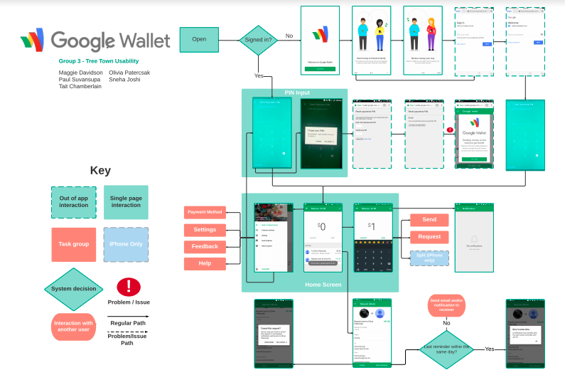
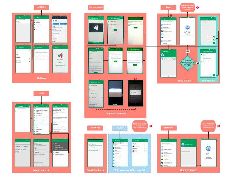
An interaction map of the Google Wallet system was performed to familiarize ourselves with how the product works and what it consists of, and also to have a point of reference when we continued on with our research.
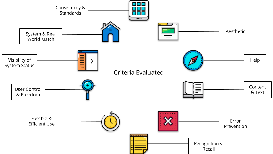
To find usability problems and continue familiarizing ourselves with the system, we used Nielson's Heuristics schema, specifically in regards to the following items:
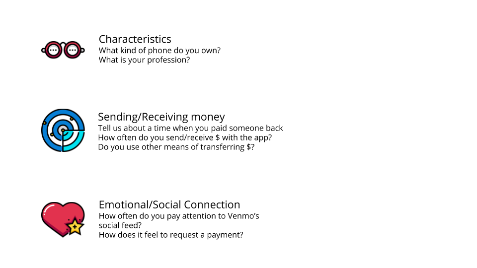
We wrote and conducted 5 interviews with Google Wallet and Venmo users between ages 18-24 years (University-aged) to understand what this target demographic finds pleasing and displeasing about Google Wallet and to understand the context and motivations of using a peer-to-peer payment system.
Sample of Interview Questions:
Interview Quotes:
"I only use [Google Wallet] because my friends are using it."
" Google Wallet feels very transactional. It’s like I’m doing a financial transaction, and I don’t know who with, and I think Venmo feels a little bit more social."
"I always feel a little bit uncomfortable requesting money."
We conducted comparative market research to understand the market space of peer-to-peer (P2P) payment applications and help us understand how Google Wallet can differentiate itself from its competitors.
Comparative Matrix:

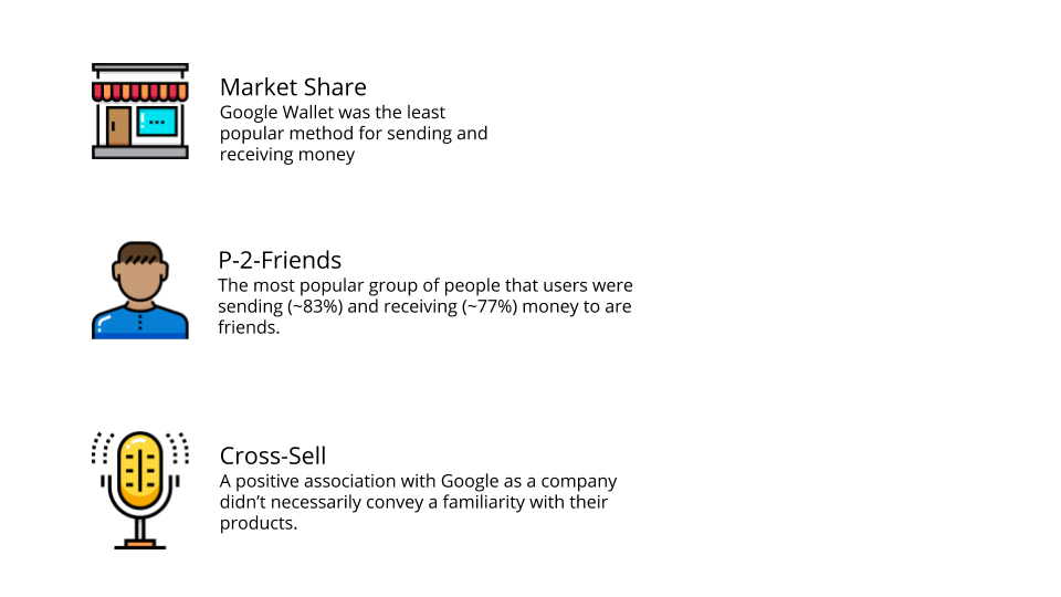
We created and sent out surveys to understand existing user issues, and to understand their behaviors and attitudes regarding P2P applications and processes, as well as payments and Google in general.
Survey Takeaways:
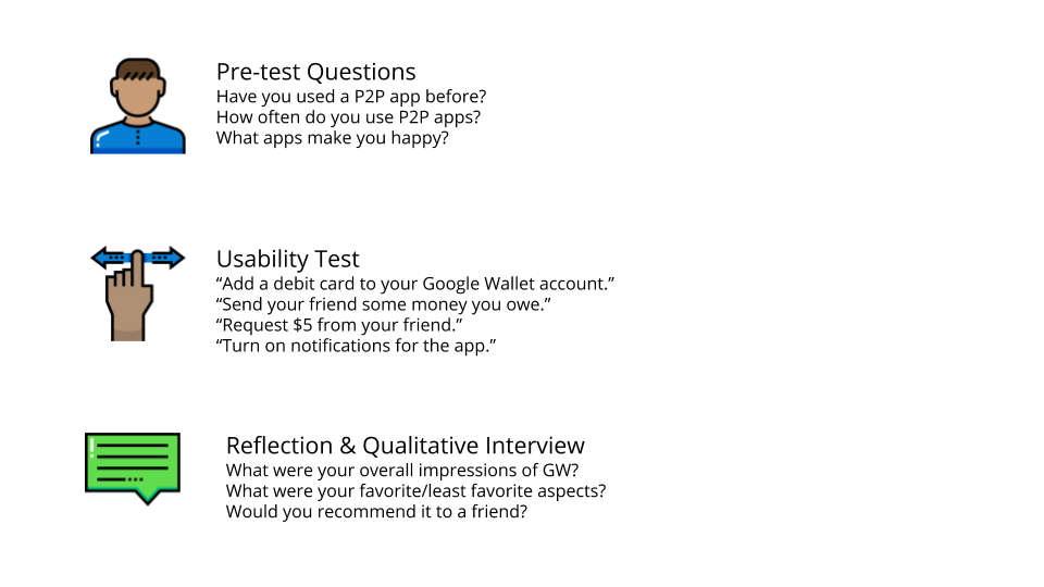
Usability testing was conducted to observe the user's painpoints to and understand their behavioral patterns when approaching the system's key function.
Sample Usability Test Questions:
This will let users know that their request or submission has been received by the end user, to diminish uncertainty, and to increase trust within the system.
This will streamline the send/request money process for users and diminish confusion as to how to initiate a transaction.
A dedicated button will allow users the option to send emojis in a consistent way across operating systems and create a warmer, social atmosphere.
To increase usage and awareness, it is important to emphasize the different use scenarios between Google Wallet and Android Pay, as well as to familiarize users with Google Wallet's key features and capabilities.
The icorporation of these animations can create a fun, social experience versus the "cold, transactional" feel that Google Wallet emits, while keeping in line with the Google brand.
Thank you to Google Wallet and my SI 622 team for making this an awesome learning experience!